The Meaning of Shapes and How to Use Them Creatively in Your Designs

The success of any visual storytelling or visual marketing strategy relies mainly on what the audience perceives. Today, I want to go back to basics and talk about how all the things we see can be associated with simple shapes and how the use of these shapes affects the outcome of our strategies.
Anything and everything, from elements in a photograph to a certain typography can be analyzed in terms of shape. All the bits and pieces inside our presentations, infographics and visual strategies are telling their own story. It is up to us to put these pieces together in a way that creatively and effectively tells our story. Let me show you how…
Conscious Combination of Shapes and Color
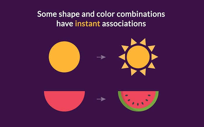
When using shapes in your graphics and designs, you will most definitely be using color as well. The combination of certain shapes and colors already have a defined connotation in our subconscious. For example, a yellow circle usually represents the sun, while a red half-circle can represent a slice of watermelon. Unless you are trying to send a direct message with your composition, shapes and colors are mostly an accessory and should be considered as such.
Using Shapes to Create Something Else

You can also use shapes as elements of a larger image. A group of violet circles, for example, can be combined to form a bunch of grapes; a white rectangle and two white triangles can come together to form an envelope; a few squares and rectangles can make a house. All these possibilities and more are out there for you to play with. But you must think about what your end goal is.
Do you want to design your own branded icons? Or create your own backgrounds? Do you want to combine your photos into a collage that represents something, like the shape of a fish, for example? Shapes are your best allies for these kinds of creations. All you have to do is play with them until you arrive at a composition you like.
Using Shapes as Accessories
For designs like presentations, infographics and social media graphics, shapes are more commonly used as accessories or complements. This doesn’t mean that they are less important — on the contrary! As accessories, they say more on their own.
How we place our accessory shapes can tell many different stories. There is a psychology behind shapes that you may not even be aware of. There are emotions and feelings evoked by certain shapes, inspired by cultural conventions and forms seen in nature. We cannot create without shapes. Even the paper we write or draw on is a shape; our screen is a shape!
Let’s go further into understanding shapes and their (not so) hidden messages.
Geometric, Organic and Abstract Shapes
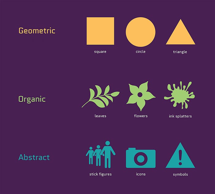
All possible shapes fall into three main categories: geometric, organic and abstract.
Geometric
Geometric shapes are the ones we first learn about as little kids. They’re the simplest, most common shapes of all: squares, circles, triangles and their derivatives, such as rectangles, ovals and polygons. Most geometric shapes are symmetrical and instantly recognizable, but they also convey silent messages, which I will cover later in this post.
Organic
Organic shapes are those that represent things we know about nature and life around us. The most common organic shapes are plant-based, like flowers and leaves. Another kind of organic shapes are those that represent forms we can create ourselves, like paint splatters or watercolor blobs. These kinds of shapes are mostly asymmetric and their kinds of lines can vary.
Abstract
Abstract shapes are depictions of real things without being exact representations. The icons we see in web design, our phones and in street signs are abstract shapes that we are quite used to seeing and can easily recognize. A great example of an abstract shape is a stick figure, which represents a person. Symbols are also considered abstract shapes.
Squares and Rectangles
The shapes we come across the most in designs and our everyday lives are squares and rectangles, in both horizontal and vertical layouts. Street signs, shop signs, social media headers, blog headers, business cards, sheets of paper — all are rectangles.
The familiarity of squares and rectangles makes them easy to use as the base of a design or as a frame. Squares and rectangles make us feel safe and contained. They give a sense of stability and assurance but also easily fall to the background, and the feelings they convey are mostly subliminal.
The Rule of Thirds
Using squares and rectangles as the base of a composition is good practice. Experimenting with the way rectangles and squares can be scaled and put together can serve as a visual exercise when designing a new graphic. There is one very important design practice called the rule of thirds. It’s all about how rectangles and lines control the balance in any composition.

The best way to visualize the rule of thirds is as a grid. The best websites are designed and developed following a grid. Graphic designers use grids for better composition. Architects use grids for better measurements. What are grids composed of? Squares and rectangles (and sometimes triangles if you want to use a more complex perspective grid).
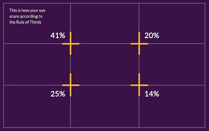
The rule of thirds is essentially a grid that separates your canvas space into nine equal sections. The idea behind this is that the human eye has a natural direction in which it prefers to move from object to object. The most important areas are the intersection points, starting at the top left and then either the one on the immediate right or straight down. The bottom right corner is the intersection point that attracts the least attention.
Circles
In design, circles have different uses for different purposes. In logo design, for example, circles are the most common and widely seen shape or background outline for a logo. In websites, they are mostly used as buttons and small icons. Why is it that we see so many circles used as accessory shapes in websites, graphics and even infographics? The reason behind this is that circles are very noticeable, and quite powerful.
Circles represent wholeness, a natural sense of completion. When we think of things shaped as circles in the world around us, there are so many things that we can name.
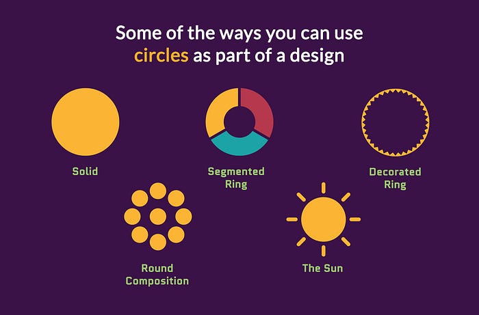
Some things that circles can represent:
- The Sun
- The Moon
- The Earth
- Any planet
- A ball
- An orange
- A ring or band
- A smiley face
- Buttons

Take into consideration the power of a circle and how it can affect your designs. Circles can represent constant movement, such as spinning or rolling. The outline of a circle can serve as a band or ring representing a cycle or continuing action. A circle can represent a hole punched out on a page. A circle with a subtle shadow effect can look like a sticker or button that has been “placed” over the rest of the design.
Triangles
Triangles have two meanings depending on their position. When pointing up, they represent stability and power, when pointing down they become unstable. The triangle is primarily a masculine shape, but when inverted it also represents female reproduction. In spirituality, triangles represent the union of body, mind, and spirit.
In design, skinny triangles can be used instead of arrows or pointers. Smaller triangles can be used as shapes in a collage with an interlocking composition or mosaic effect. Larger triangles are more noticeable, so you should take into consideration their meaning before using them in larger sizes. It is always best to use triangles that sit comfortably on a base or with a point facing to the right, conveying a message of moving forward.
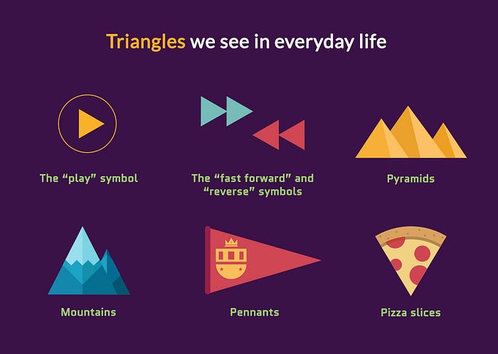
Triangles we see in everyday life:
- The “play” symbol
- The “fast forward” and “reverse” symbols
- Pyramids
- Mountains
- Pennants
- Pizza slices
Triangles can also be used to break from the traditional, square design. They can be put together in countless ways to create all sorts of dynamic designs, such as the one below.

Pentagons, Hexagons and Octagons
Pentagons, hexagons and octagons are geometric shapes with five, six and eight sides respectively. These are the most commonly used polygons with more than four sides. There are lots more of course, but these three are the most versatile for creating graphics.
Let’s review what each of these shapes are reminiscent of in our daily lives to best understand how they can be used in our designs.
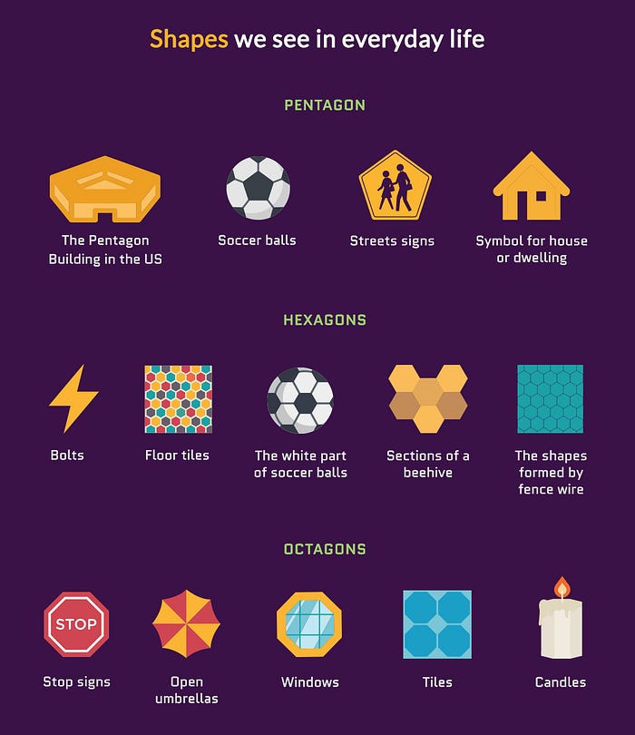
Pentagons
- The Pentagon Building in the US
- The black shapes on a soccer ball
- Some streets signs. For example: Children / School Crossing
- Symbol for house or dwelling
Hexagons
- Bolts
- Floor tiles
- The white shapes on a soccer ball
- Sections of a beehive
- The shapes formed by fence wire
Octagons
- Stop signs
- Open umbrellas
- Windows
- Tiles
- Candles
Using Polygons on Their Own
A few simple ways to use any of these polygons is to insert text inside of them or cut out images as shapes. You can use these techniques in blog post header images, Pinterest pins, Instagram graphics, YouTube thumbnails or presentation slides.

Using any of these polygons instead of a regular rectangle or square will give your graphic a different feel from the usual. Understanding the message behind each of these shapes is key to choosing the best one for your brand or message. Use the list above to think about what these shapes remind you of and consider how this affects your design.
Using Polygons as Interlocking Shapes
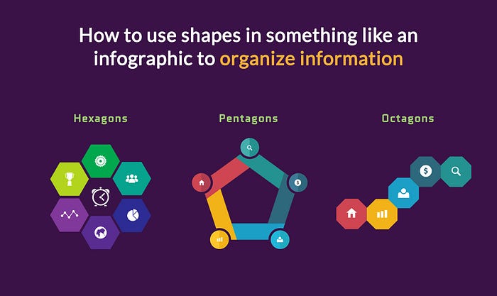
These shapes can also be used as puzzle pieces to create a larger composition and organize information, such as in an infographic. With hexagons, you can design a beehive style composition with analogous colors. With pentagons and octagons you can design something similar in either horizontal, vertical and even diagonal directions.
Pentagons, hexagons and octagons can also be separated into smaller shapes such as triangles to create a progression with a visually circular motion or a visualization similar to a pie chart.
Natural Shapes
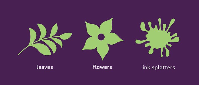
Natural or organic shapes represent things and animals found in the natural world, such as leaves, flowers, trees, or man-made things like paint splatter and ink droplets.
You should definitely use these shapes if your design is related to the environment or ecology. These kinds of shapes also work great for graphics about the great outdoors, like hiking, camping and the like. If your business has to do with flowers, then you can go beyond just using images of real flowers by using natural shapes as accessories for your graphics.
You can use natural shapes on their own or as part of a larger composition, such as in the examples below. But keep in mind that these kinds of shapes have a clear meaning and message — they are not very subliminal at all.

Symbols and Icons

Symbols and icons are kinds of abstract shapes. They can represent ordinary things and they can also carry a higher symbolism, either religious, political or cultural. Symbols and icons are especially useful when creating graphics because they convey messages quickly.
The difference between symbols and shapes is that regular shapes can be used in greater quantity within a design, while too many symbols can be overwhelming and can create confusion. Keep the use of symbols to a minimum, and if you do use them, choose them wisely.
Icons are often seen in infographic design to minimize the use of text and call attention to certain key messages. But you need to choose icons carefully in order to stay on brand. Make sure you change the color scheme of your icons to fit your brand and only use one style of icon within the same infographic.
Stars
Besides geometric shapes, stars can also be considered symbols as they are often used in religious depictions and have a variety of connotations. Stars are memorable and often symbolize notoriety and importance. Our eyes will always be drawn to a star (especially if it’s yellow or gold) before any other shape.
Stars are great shapes for framing sale prices, special information about a product or promotion, a discount or a bonus. Yellow stars can remind us of the golden stars we received as students, while blue stars will bring to mind first-place ribbons. Use stars accordingly to convey the proper message.
What do we associate stars with?
Five-pointed stars with the point facing up:
- Golden star stickers
- Stars in the sky
- Prizes and awards
- Hollywood Walk of Fame Stars
- Movie stars
- Christmas star
Arrows
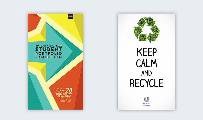
Arrows come in all different types of designs and styles, each with a unique vibe. Bold, solid arrows will convey more strength than thin or hollow arrows. Squiggly arrows can give your design a playful air. Arrows can be quite small, for use in bullet lists, or quite large to house text inside them. Concentric arrows, in triangle or circular forms, can be used to represent cycles and processes. The international symbol for recycling is a triangle made out of arrows.
Direction
An arrow’s greatest purpose is to convey direction. Using arrows can help your viewer follow a path of information from one part of your graphic to another. You can also use arrows in “before-and-after” graphics or other sorts of transformations. Like with icons, it’s best to stay on brand and use a consistent style of arrow throughout your design. If you use hand-drawn arrows in one infographic, you should not combine them with thick, blocky arrows.
Shapes and Symbols of the Digital Generation
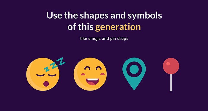
Emojis
Using emojis in graphics is quickly becoming a trend that doesn’t seem like it will go away very soon. If your clientele is comprised mostly of young people, you should look into using emojis in your graphics. Millennials text using emojis instead of words. Why not tap into that and use it to your advantage?
Pin Drops
Pin drops are the shapes we have come to know via Google maps and other location apps. You can use customized pin drops in your graphics and maps if you have a travel company, for example. Visme has an entire section of pin drops in its icon library!
Staying on Brand with Shapes
One thing we need to keep in mind when using shapes to create graphics for our visual marketing strategy is that we should always stay on brand. When creating a visual style guide, you should establish a selection of shapes that are to be used for all brand graphics. Try not to use shapes willy-nilly every time you create a new graphic.
If your squares and rectangles always have rounded corners, keep it that way. If you use octagons to frame text, then always use octagons.
Think of your readers, clients and followers. They will remember your brand better if they can say something like, “that brand with the cool hexagon,” or “that brand with the concentric arrows.” Keeping a conscious consistency is key to staying true to your visual identity.
Your Turn
Free visual content tools such as Visme come with vast icon libraries, which include everything from geometric and natural shapes to icons and symbols. You can also change the color scheme of your shapes to make it easier to stay on brand.
You can take it a for a test drive here and share your unique creations with me below. Happy designing!
The original version of this post first appeared on Visme’s Visual Learning Center.
