8 amazingly Innovative Types of Visual Content (You Probably Haven’t Tried Yet)

Using visual content is a tried-and-true method to increase interest — whether it’s used to drive traffic to blogs or to sell a particular product.
As Jesse Mawhinney points out, including visual content makes people about 80% more likely to read through an article or post, and 65% more likely to remember that content.
With so much visual content on the web, it can be hard to stand out. Much of the available visual formats have been used over and over again across the web.
But that doesn’t mean there aren’t some rather creative and innovative things out there. Listed below are eight innovative types of visual content from 2016 that can be easily implemented in your own visual marketing strategy.
1 Cinemagraphs
<iframe> src=”https://media.flixel.com/cinemagraph/fkwykyhldwuz2tn2y4ld?hd=false" width=”800" height=”450" frameborder=”0" allowfullscreen=”allowfullscreen”></iframe>
While likely a rather innovative idea when first introduced, they’ve become commonplace. So what’s a simple way to reinvigorate these visuals and possibly make people look twice?
Simple: only having parts of the image move.
These images are called “cinemagraphs,” and they’re quickly gaining steam.
For example, Aja Frost shows a cinemagraph from Coke, and notes that the image quickly reached over 80,000 notes. The cinemagraph in question is a Coke can with a moving water background.
Cassandra King lists several other examples, as well as useful ways to implement them.
For example, the Netflix original series, House of Cards, uses a cinemagraph where the individual characters are still inside a car, shown to be ‘moving’ by the passing images outside the window.
King also adds that cinemagraphs can be used to great effect through email or ads, though they can just as easily be used to make a website more interesting.
What makes cinemagraphs so effective? They’re different; unlike a still image or the now-common GIFs, the combination of moving images and still objects registers as something unusual to our brain, making us pause long enough to look at the image.
The good news is that cinemagraphs are now as simple to create as GIFs thanks to visual storytelling apps like Flixel.
2 Progress GIFs
“But wait,” you say, “surely there are still ways to make traditional GIFs interesting!” Indeed there are, and progress GIFs are a great example of this.
Progress GIFs are exactly what the name implies: GIFs that show the progress of how something has changed or developed, whether that be over the years, through testing stages, or something else.
Kerry Jones gives us the above example by eBay Motors. The GIF illustrates a car morphing into various models, illustrating how tastes — as well as the individual product types — have changed over the decades.
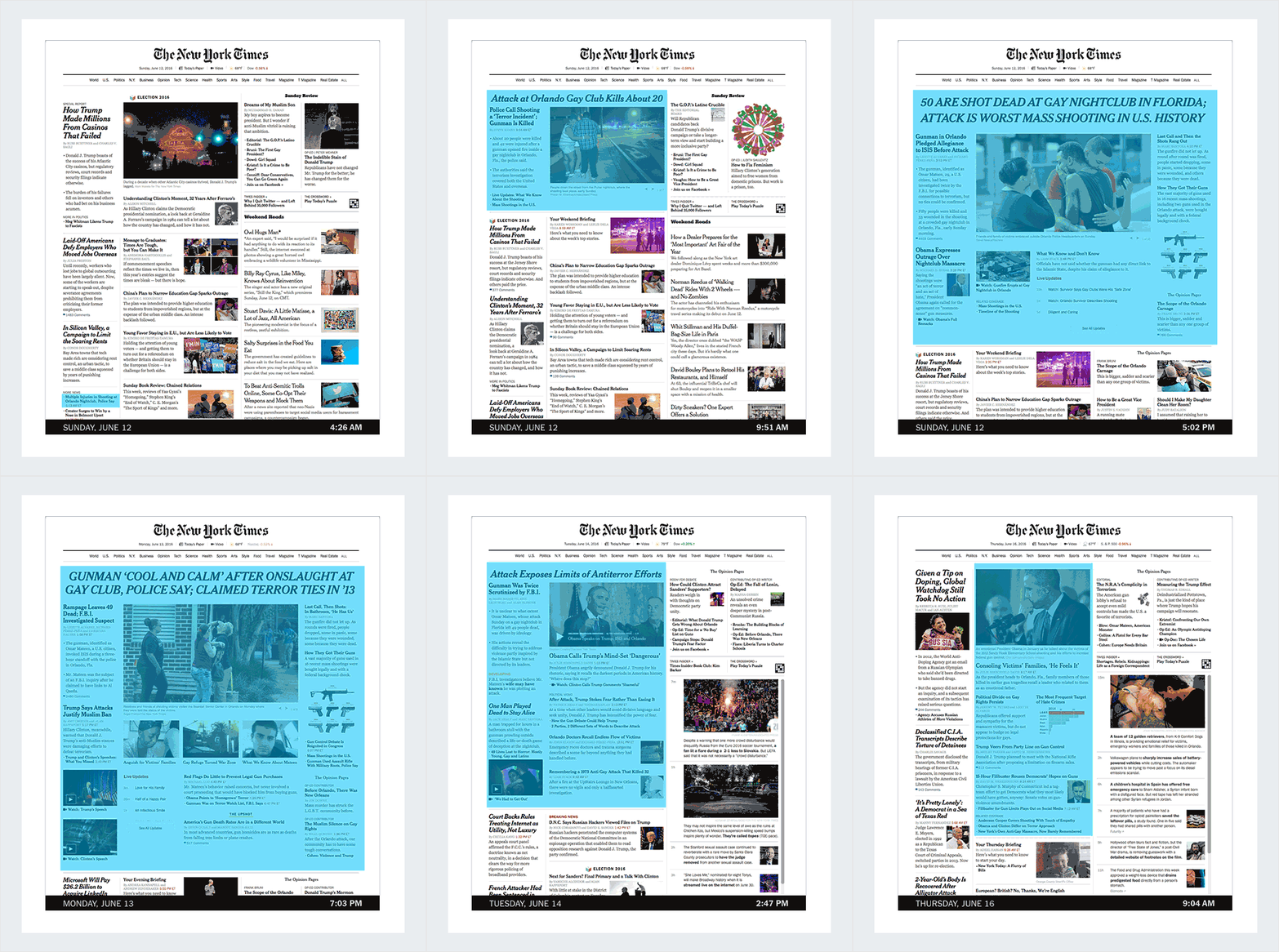
Progress GIFs can be an interesting way to give insight into a development process.
For example, an artist could use them to illustrate how a character’s design changed from start to finish, and animators will sometimes use something similar to show their steps from storyboard to finished animation.
You can just as easily use these GIFs to create a sense of nostalgia, such as with popular, long-running shows, or to encourage people to “move forward into the future” by hinting at what designs may be to come.
It all depends on what you’d like your audience to focus on.
3 Image Sliders
Interactivity is a great way to increase engagement with your audience. What better way than to create interactive images?
Before and After


John Gara uses these interactive slides to create comparisons between similar-looking celebrities. By moving the slide one way or another, you see more of one picture and less of the other, perfectly placed over each other.
The interactivity makes for a creative, interesting way to get a point across, as well as helping the information to stick in an individual’s mind. This specific form of interactivity is great not only for “before” and “after” comparisons: It can also be used to show the change over time or to compare two similar looking people or objects.
Other potential applications would be to use it in a sort of “quiz game” where the answer to a question is discovered by moving the slide one way, or by showing the differences or relationships between two separate topics by moving the slider back and forth.
4 Visual Metaphors

Visual metaphors and symbolism are used all the time in advertising and art. IKEA, however, took this idea to the next level.
They launched a clever ad campaign in which the company expressed how cheap their products were. In this effort, they used several cheaper products which, when placed together, would show an image of one of their products.
For example, one ad features images of disposable coffee cups and packs of sweetener that, when placed together, reveal an IKEA table.
IKEA’s campaign is simple but effective: By creating visual representations of their products using images of cheaper ones, they quickly communicate the idea that their furniture is affordable.
This idea isn’t limited to traditional marketing campaigns; the idea is as versatile as you can make it.
For example, you could use a collage of different items to create a person in order to indicate what that individual values.
Think about what you are most interested in communicating with your visuals, and use items that would get that message across through a visual metaphor.
5 Negative Space
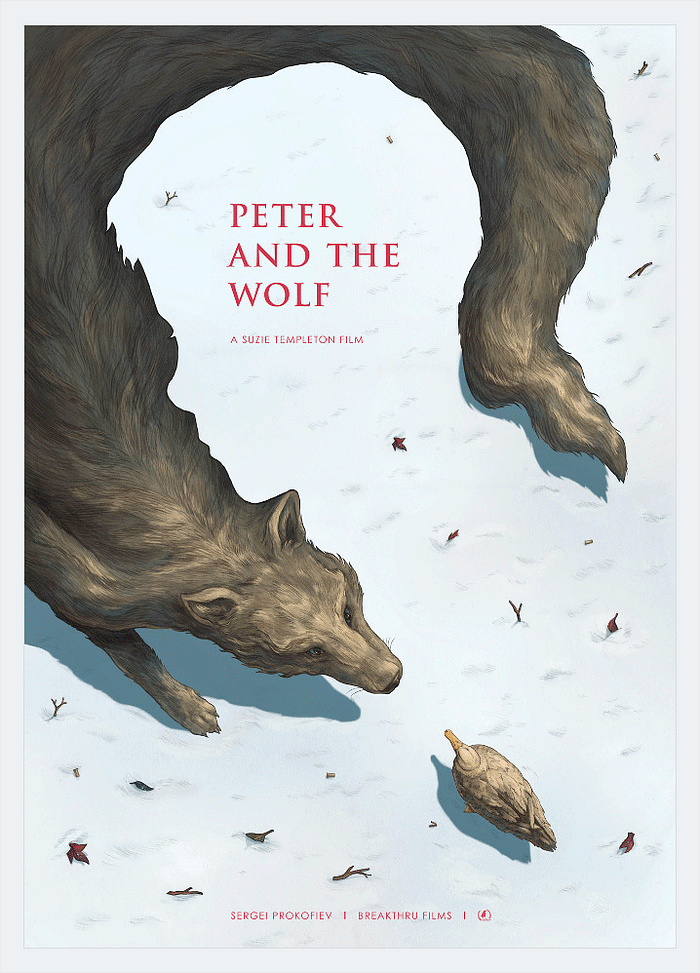
As most artists know, what isn’t there can be just as important as what is. The area that surrounds an image is called ‘negative space,’ and it helps define an image’s boundaries.
You can also use negative space creatively. The staff at Creative Bloq recently wrote an article on how different artists are using negative space to create different effects.
A good example is the first image on the page, of the cover of a version of Peter and the Wolf. The wolf arcs across the top and left of the image, but the inner contours of his body create an image of Peter’s head. The effect allows both characters to ‘appear’ in the image without directly including them, and makes people look twice.
The page continues with many more fascinating uses, such as with the NBC logo, an individual painting the negative space with a vibrant background, and the FedEx logo (a hidden arrow). Each individual piece can invoke a different emotion or draw an individual’s attention to a different area.
As can be seen from some of the examples, you don’t need to be an artist to create interesting designs using negative space. Sometimes, all that’s needed is a dose of creativity and visual thinking skills to create engaging visuals.
6 Bitmojis

Emojis are frequently seen across the web. But Bitmojis takes things a step further by allowing you to create your own, personalized emojis to express yourself.
Jade Furubayashi, in covering how visual content has changed recently, looks at bitmoji, and Snapchat’s partnership with the brand. Bitmoji can easily be used where text would once have been, meaning that people would absorb the information quicker.
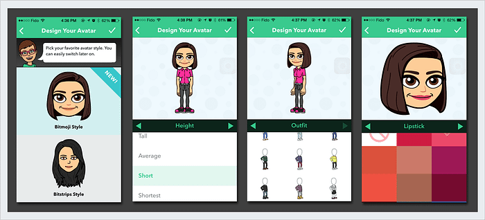
While the most obvious use of bitmojis is on Snapchat, regular emojis can be used on almost any site, and can be used in creative ways, such as to actually tell a story, or simply to create a sense of familiarity with viewers and readers.
An article found in the Eclipse Marketing Blog gives several examples of successful emoji use. One of the more creative versions is Domino’s pizza, which uses emojis to allow customers to order on the go, but they can just as easily be used in other platforms. Companies such as General Electric use emojis to get around text limits, while Chevrolet used only emojis in a recent press release.
7 Mixed-Media Infographics
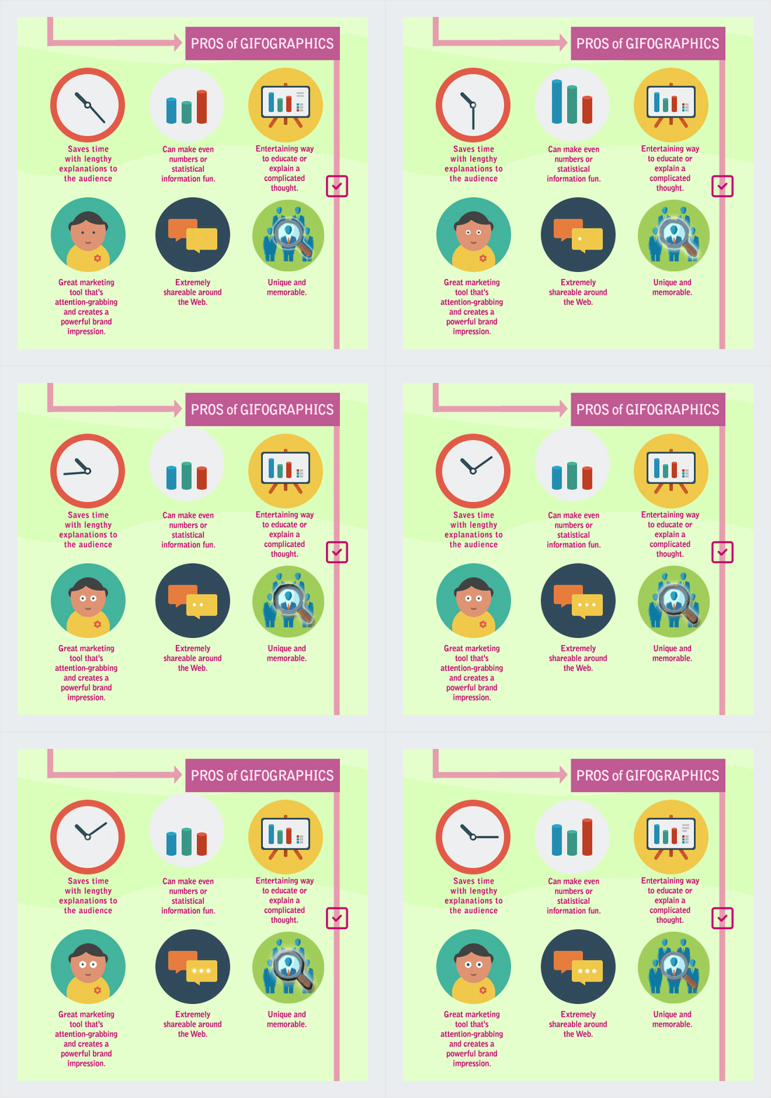
Infographics have boomed in recent years, and it’s little wonder: They easily get across large amounts of information, while making boring text more interesting by transforming it into visuals. However, much like GIFs, the widespread use of infographics means they’re much less likely to catch as much attention as they once did.
Like GIFs, however, there’s also a simple solution: mixing media.
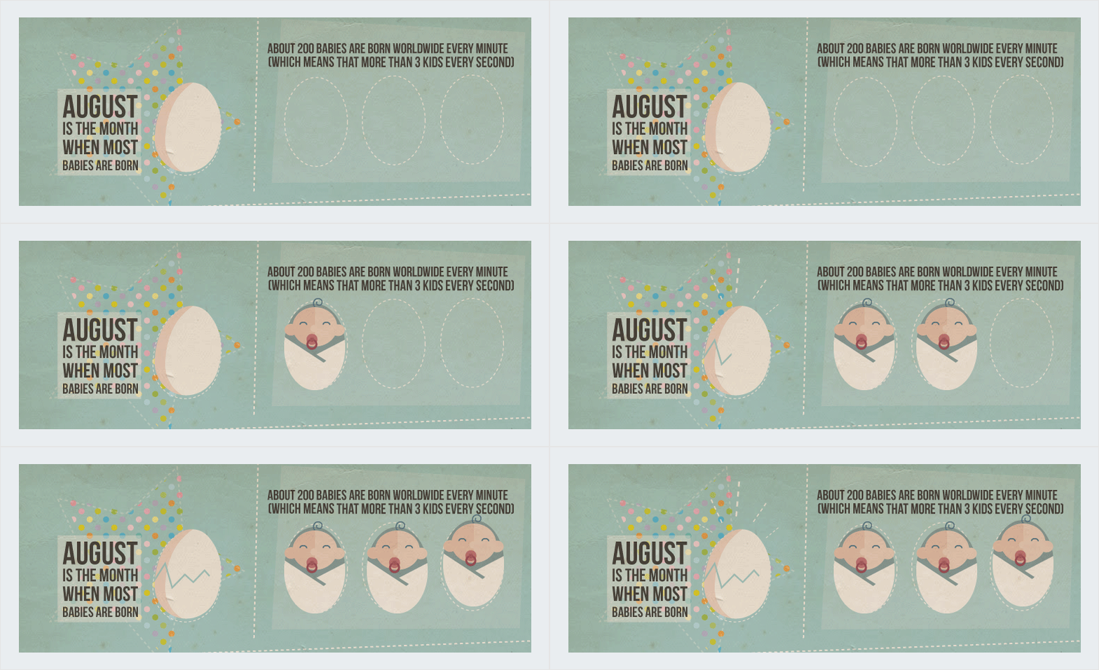
This infographic from NeoMam Studios is a great example of this. The scrolling page still features the information in a visual format, but also includes several moving pieces — whether they be animated on their own, or moving as you scroll down the page. The infographic ends with a clock that tells you how long you’ve been on the infographic’s page.
The infographic retains attention not only for its creativity, but because the moving pieces combined with static images help attract attention.
8 Meta Images
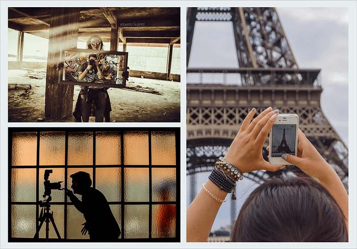
Most likely, you’ve heard the word ‘meta’ if you’ve been on the internet any amount of time.
A ‘meta’ work, typically, is something that draws attention to the fact that it is a created project, such as by describing how it was made or directly addressing the audience in what would traditionally be a closed-off work. This is typically used in relation to fiction, but can just as easily be applied to other media.
A good example of meta work is the infographic listed above in the previous point — it’s an infographic about infographics.
Images can very easily be translated into meta works, by potentially pointing out how the style of image is affecting how you think about it, or by calling itself an image.
For example, the headline image of an article by Taylor Houston is of hands drawing themselves on a sheet of paper. Meta commentary can also be very easily found in comics, such as in the examples found here.
Meta concepts have been known to be used in the business world, such as the “Words Hurt” commercial by Geico. In it, a man attempts to ride off into the sunset, only to run into the “e” in “The End” and fall off his horse.
A Final Word…
These are just some examples of innovative ways to create — and recreate — visual content.
You can start coming up with your own innovative visual content ideas by trying your hand at DIY graphic design.
For example, here is a free online tool that allows non-designers to create all types of visual content, from animated infographics to social media graphics.
What are some unique ideas you’ve found across the web? Some you’ve thought of? Leave a comment and let us know!
This article was originally published on Visme’s Visual Learning Center
